 |
  
Makes your elements resizeable for the user.
Screenshots:
| |
 |
|
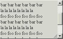
No Scrollbars: floating is not set to auto nor to scroll. So the div will use more space if needed. The resize grip will always look that way. |
| |
| |
 |
|
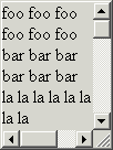
Vertical Scrollbar: in this case, floating has been set to auto. And since there is too much content, we have a vertical bar. Our resize grip has to move a bit to the side. |
| |
| |
 |
|
Perfect world: this is how it WOULD look with both scrollbars. Unfortunately, browsers don't allow us to put something on top of scrollbars. See next screenshot. |
| |
| |
 |
|
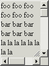
Both Scrollbars: so this is how it looks with both scrollbars. Not as nice, but works. |
| |
| |
 |
|
Textarea: just another example where usage can make sense. |
Features:
- Define bounds: minWidth, maxWidth, minHeight, maxHeight
- Attach events: onBeforeResizeStart(), onAfterResizeStart(), onBeforeResize(), onAfterResize(), onBeforeResizeEnd(), onAfterResizeEnd()
Examples:
Download:
This component ships with the full "BlueShoes Framework" package, the "BlueShoes JavaScript" package and the
"BlueShoes JavaScript ResizeGrip" package.
See the download page.
Documentation
API-Doc
License:
Available with
- BlueShoes "developer extended" license
- BlueShoes commercial licenses
Check the license overview page for details.
|
 |
|


